Local population composition and poverty matters for pandemic preparedness
COVID-19 posed one of the most profound public health crises for a hundred years. The full death toll associated directly or indirectly with the COVID-19 pandemic (described as ‘excess mortality’) was estimated by the World Health Organisation at a staggering 14.9 million.
During the COVID-19 pandemic, it became increasingly clear that deaths were disproportionaly concentrated within older ages and certain groups. It became clear that the infectious disease caused by the SARS-CoV-2 virus was more lethal for older individuals, but also geospatially patterned factors by high population density and socioeconomic deprivation. Given the nature of airborne infection, it soon became clear that certain groups were more impacted by the virus, including larger households and essential workers in high-contact health and service occupations, along with individuals who had existing co-morbidities (cardiac disease, diabetes, asthma) that exacerbated the illness.
Since these factors vary strongly by local and regional area, there is an urgent need to map, analyse and predict how the concentration of certain groups more vulnerable in emergencies and pandemics could result in a mismatch between health care demand and supply at the local, fine-grained geospatial scale. Understanding geospatial variations are key for effective strategic allocation of limited health care resources as well as crucial in informing effective disease monitoring and prevention.
"Based on demographic predictors, we offered new geospatial tools to predict, plan and prevent hospitals being overwhelmed during an emergency."
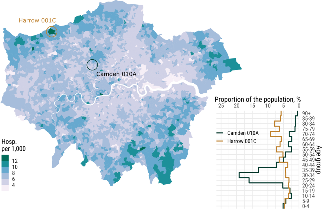
As we described in BMC Medicine (2020), there was a geospatial link associated with a local area’s age structure, social deprivation, population density and ethnicity and the risk of being hospitalised. The figure shows a fine-grained map of the city of London, with the darkest colour representing the highest level of expected hospitalisation. The line chart to the bottom right shows the proportion of the population across different age group by one of the youngest neighbourhoods of Camden compared with one of the oldest of Harrow. Here we predicted hospital hotspots according to which hospitals we predicted would be overwhelmed due to having older populations that had a higher chance of hospitalisation but and a limited number of intensive care beds. Based on demographic prediction of age alone, our prediction of hospitals being overwhelmed was correct, offering new tools to predict, plan and prevent supply and demand during an emergency. In fact, Northwick Park Hospital in London was the first major London hospital to declare a ‘critical incident’ on March 20, 2020 after it ran out of intensive care beds.

Note: LSOA local differences in expected general care hospitalization (per 1,000) in case of a 10% overall infection. London, Source here.
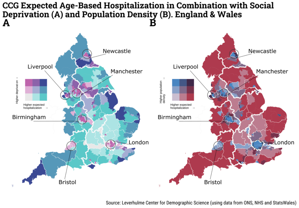
It was possible to map the geospatial risk of COVID-19 in England and Wales patterned by the local age structure, social deprivation, population and ethnicity. The figure below is coloured according to the bivariate relationship between higher expected hospitalisation and: higher deprivation (left) and population density (right).

Note: CCG refers to Clinical Commissioning Group.
Using the Mapineq Link interactive dashboard to explore pandemic and emergency preparedness
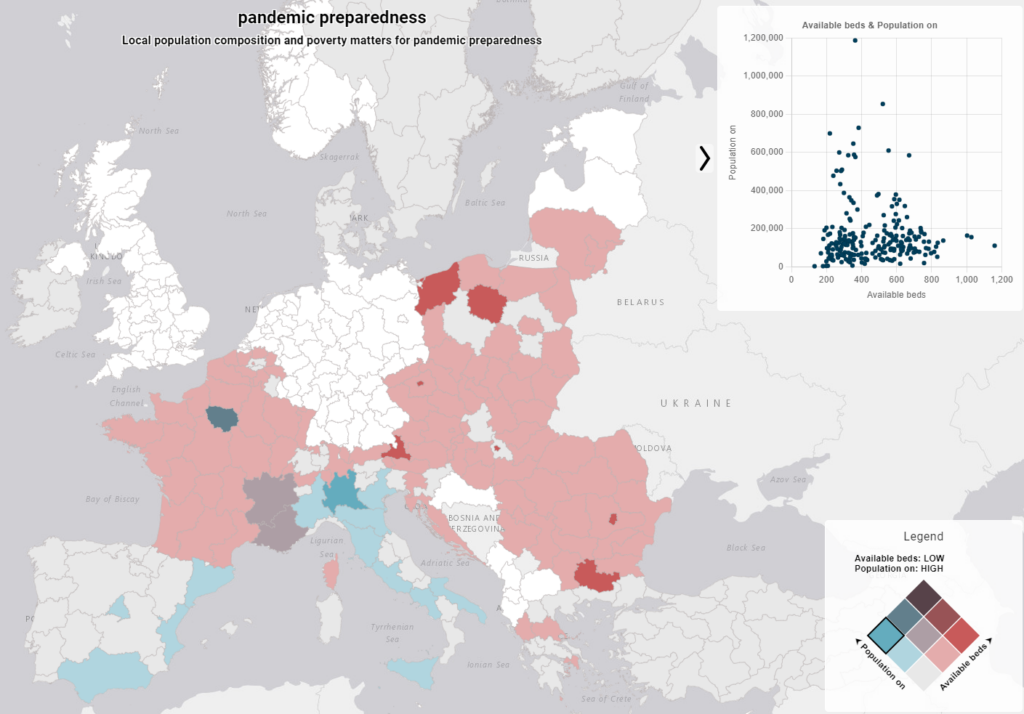
Our Mapineq Link interactive dashboard allows you as a policy-maker, journalist or researcher to examine and explore similar topics related to pandemic and emergency preparedness. For example, in the figure below we show the local population level by available hospital beds at the NUTS 2* level. The plot in the upper right hand corner maps the relationship between the two selected variaables of population size and available hospital beds.
The map is coloured according to the bivariate relationship of the population size by the availability of hospital beds. By hovering with your mouse over the Legend, you can explore these relationships. The colour highlighted in the bivariate legend below shows that the medium blue colour represents regions with high populations, but low available hospital beds. Whereas some regions (bright red) have low populations and a high number of hospital beds.

In a response to pandemic unpreparedness, in 2024, the World Health Organisation (WHO) updated previous efforts to introduce a revised pandemic prevention, preparedness and response accord. The aim is to improve nation’s public health and preparedness and response capabilities for emergencies. The Mapineq Link dashboard allows policy-makers, governments and researchers to rapidly identify more fine-grained high-risk areas to prepare and react for the next emergency or pandemic.
*NUTS 2 refers to the Nomenclature of Territorial Units for Statistics which is a geocode standard for referencing the administrative divisions of countries for statistical purposes. The standard, adopted in 2003, is developed and regulated by the European Union, and thus only covers the EU member states in detail. The current NUTS classification effective from 1 January 2018 lists 92 regions at NUTS 1, 244 regions at NUTS 2, 1215 regions at NUTS 3 level, and 99,387 local administrative units (LAUs).
(Written and updated 22 September 2024, Melinda C. Mills)
