Mapineq Dashboard and Data Catalogue
The Mapineq dashboard and data catalogue provide a user-friendly and interactive pathway to explore the rich diversity of spatial data on drivers of inequality and inequality indicators that are available in the Mapineq database. The data catalogue allows you to search by keyword to find data that you may be interested in, and the interactive mapping dashboard allows you to easily display those data on the map to explore spatial patterns and relationships with other data sets that you choose. We provide a few simple steps in the quick tutorial below to help you get started.
If you would prefer a more in-depth demonstration, please take a look at the Mapineq webinar, "Navigating the Mapineq Link Dashboard & Accessing Data", which was part of the Mapineq Webinar Series hosted by Population Europe.
Tutorial
Welcome to the Mapineq tutorial. By following the four steps below, you will recreate the results of our case study on Pandemic Preparedness. We advise you to run through this tutorial from start to finish to get acquainted with the different aspects of the system.
Step 1: Exploration
Let's suppose that you want to learn about the relationship between the amount of elderly people and the available hospital beds in a specific region. So you use the Data Catalogue to explore the available data. First, you type population into the search field.

Then you scroll down a little until you find the table DEMO_R_PJANGROUP from Eurostat.
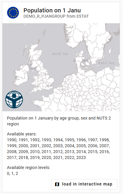
From its description you learn that it has data on the population size by age group, at NUTS level 2 for the corona years. In a similar way, by typing beds into the search field, you find that table TGS00064 holds data on the amount of available hospital beds.
Step 2: Visualization of a single variable
While still in the data catalogue, you click the button load in interactive map at the bottom of the entry for table TGS00064. The Interactive Map opens up with the right table pre-loaded in the predictor column. For this case, the right region level has been selected by default. However, you would like to focus on data from the year 2020, so you change that parameter by clicking on the Select year dropdown box.
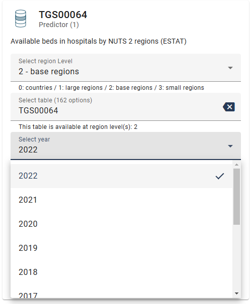
For this dataset, there are no value filters that can be changed (you will learn how to do so later in this tutorial). So you click on the Show only Predicator on map button at the bottom of the left-most panel, and after a brief amount of loading time the amount of available hospital beds shows up on the map.
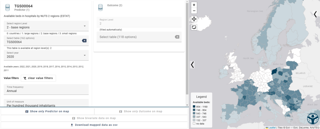
As you are particularly interested in France, this dataset seems to meet your needs.
Step 3: Visualization of two values
From your search through the data catalogue in Step 1, you remember that table DEMO_R_PJANGROUP held population data. So you enter this into the Select table search field of the Outcome column.
You want to look at both variables at the same time, so you would like to click on the Show bivariate data on map button, but notice that its disabled. That's because that for this table, there are a couple of options for you to choose (Sex and Age class). Using the dropdown menus for these Value filters, you then select the appropriate values (Total for Sex and 75 years or over for Age).
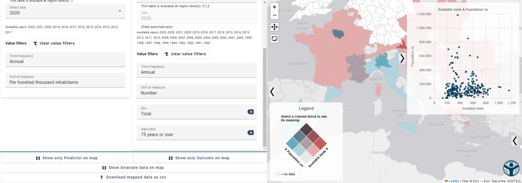
Now, the map is colored using a two-dimensional color gradient, and a bivariate plot shows up in the top-left corner. Based on coloring alone, you can tell that three regions in France stand out a little from the rest. You decide to delve into this a little deeper.
Step 4: Inspecting values
You hover over the region of Ile-de-France, and by also using the data panel below the bivariate plot, you see that the listed amount of available beds is 521,31 per hundred thousand inhabitants and that the amount of inhabitants over the age of 75 was 854.115.
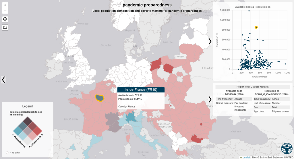
So, you conclude that for this region there is an average amount of available beds (based on this dataset), but that the amount of residents over the age of 75 is quite high compared to other regions. So you start to wonder "How did Parisian hospitals cope during the pandemic?"
Congratulations! This concludes the tutorial. You have now learned how to interact with most aspects of the data catalogue and the interactive map. Still have some questions left? Try searching our frequently asked questions page for answers.
